
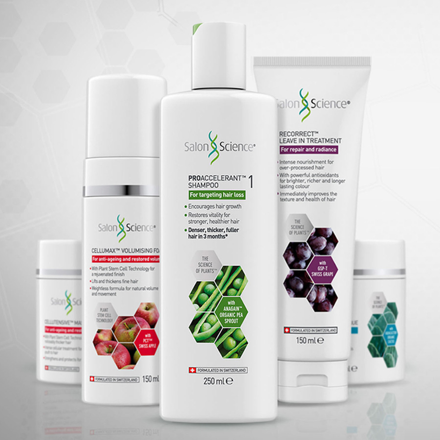
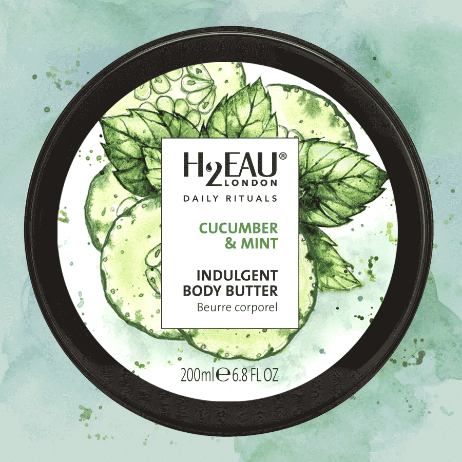
Thicker, stronger, healthier looking hair
Grow Longer is formulated with pea sprouts, naturally rich in isoflavones – protective plant compounds that help seedlings withstand pathogens, stressors, and environmental pollutants. These young, nutrient-dense shoots contain particularly high concentrations of these beneficial molecules, making them a potent ingredient for supporting healthy hair growth.
For the brand mark, a modern sans-serif typeface was customised, featuring elongated descenders on the letter ‘g’ to symbolise growth. On the label, a sleek hair-follicle icon paired with a gentle swirling motif underscores the product’s transformative benefits. The rich bottle-green colour brings a sense of luxury and depth, while the visual identity is applied consistently across the entire range – Shampoo, Conditioner and Scalp Drops.
LOGO DESIGN
PACKAGING DESIGN
ARTWORK
DIAGRAMS


Get in touch
Fill in your details and I’ll get back to you
CONTACT
rick@rsd.london
07940447729
FIND
Twickenham
Greater London
England
SERVICES
Brand Identity
Packaging Design
Website Design
Printed Communications